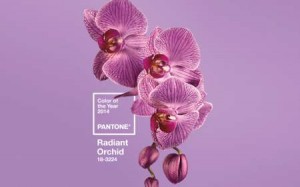
It is said (I suppose by experts) that Pantone or Radiant Orchid is the color of the year for 2014. I mention this only because recently, in my local newspaper, there was an article about home decor that featured a piece on the 2014 Color of the Year. This color is certainly ‘radiant’. In fact, it’s so radiant as to be glaring! And, when featured as the wall paint for an entire dining room, it is , well, just too much. I love color – fully saturated, strong colors. But, strong color needs to be used sparingly in most applications. I’m not decorating expert, but I do know what I like and can live with.
Since we all have different computer monitors, I’ll add the description of this color – purple just to the side of fuchsia.
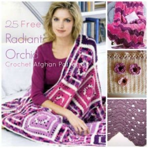
I love fuchsia. I love pink. I love purple. But, wait a minute. Does everything in a room need to be updated to Radiant Orchid? Does it even need to be the focal point of a room? What am I to do with all the other beautiful furniture I own, the doilies I’ve crocheted, the quilts I’ve inherited that might clash with this color. And, how many pieces do I want to crochet in this (or any) color? Maybe this pattern book I discovered online would help. Hmmm. I don’t know.
So, I ask you – what are we to do with the Color Of The Year?
NOTE**********************
Smart reader, Barbaranne emailed me with the following information. Please take note of it so you won’t go anywhere asking for a color called Pantone! Here’s what she wrote:
I get the daily Craft Gossip email and saw your article today on the color of the year. In the beginning of the article you said that the new color is called Pantone, but Pantone is not a color, rather, it is a numbering system to identify colors. The Pantone number for the Radiant Orchid color is 18-3224. https://www.pantone.com/pages/index.aspx?pg=21129
You can read more about it online. Here is one source. http://www.colorguides.net/pantone.html


I like fuschia but it must be used sparingly. I am not going to redecorate my house with it.
I am loving the color. I just made a hat with dark purple and blue mixed. Purple is one of my favorite colors 🙂
It Su-u-r-r-e would Brighten up the Forest! Nice Book! Thank YOU for the links to it!
Maybe refashioning something. But I dislike purple. 🙂
Be a minion and let others choose for you or you can step outside the collective and choose the colors that give you joy. Love your articles, they are inspirational think tanks for me!
I like the color, but not for my house. Maybe a little touch of it would be alright. I would wear at it as a sweater or scarf, but not an entire outfit in that color.
I choose purples over almost any other color in the spectrum. I’ve even painted rooms in parsonages lilac, to the chagrin of men on the Trustees. IMHO you need to choose cool or warm, and like every other color what’s the undertone? (Try putting together black separates and you’ll understand THAT one).
Having lived in rentals and manses, I get tired of plain old “magnolia white”. Any color beats that!
So what’s a little Goof? I’ll rem’ber to be sure to give the No# to the neighbors when they want to paint their house this color! Smile!